PON PON

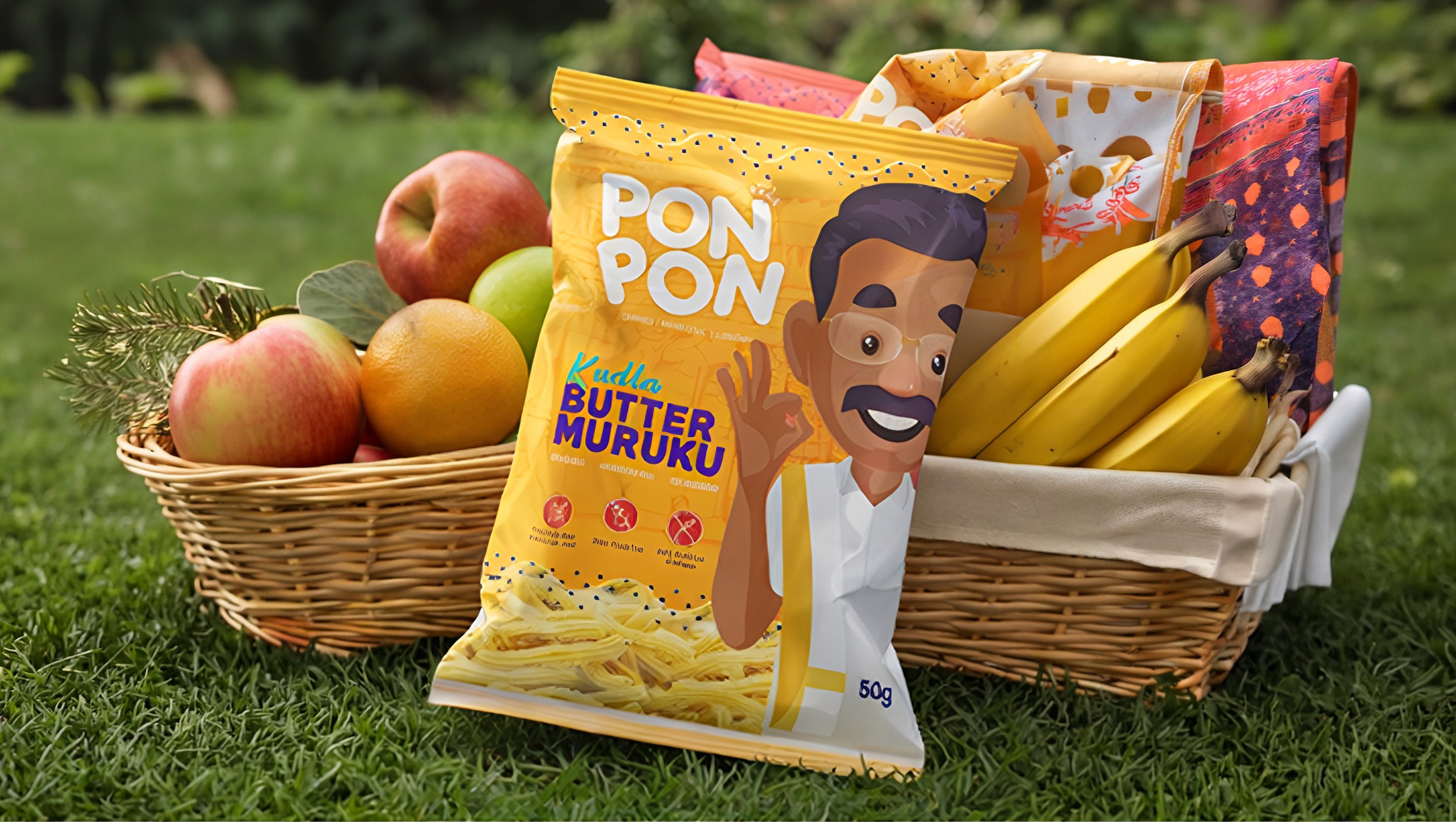
Pon Pon challenged the traditional Indian snack market by seeking a brand identity that blended the authenticity of handcrafted regional snacks with a refined, contemporary aesthetic. The primary objective was to move away from generic packaging and outdated visual cues, instead building a professional brand presence that celebrated heritage, quality, and homemade taste. Our goal was to bridge the gap between traditional South Indian flavors and modern consumer expectations, ensuring that Pon Pon evolved beyond a conventional snack label into a recognizable lifestyle-driven food brand with a cohesive digital and retail identity.


What we did :
Brand Identity
Clients
Pon pon
Artist
Karthik
Brand Characteristic.

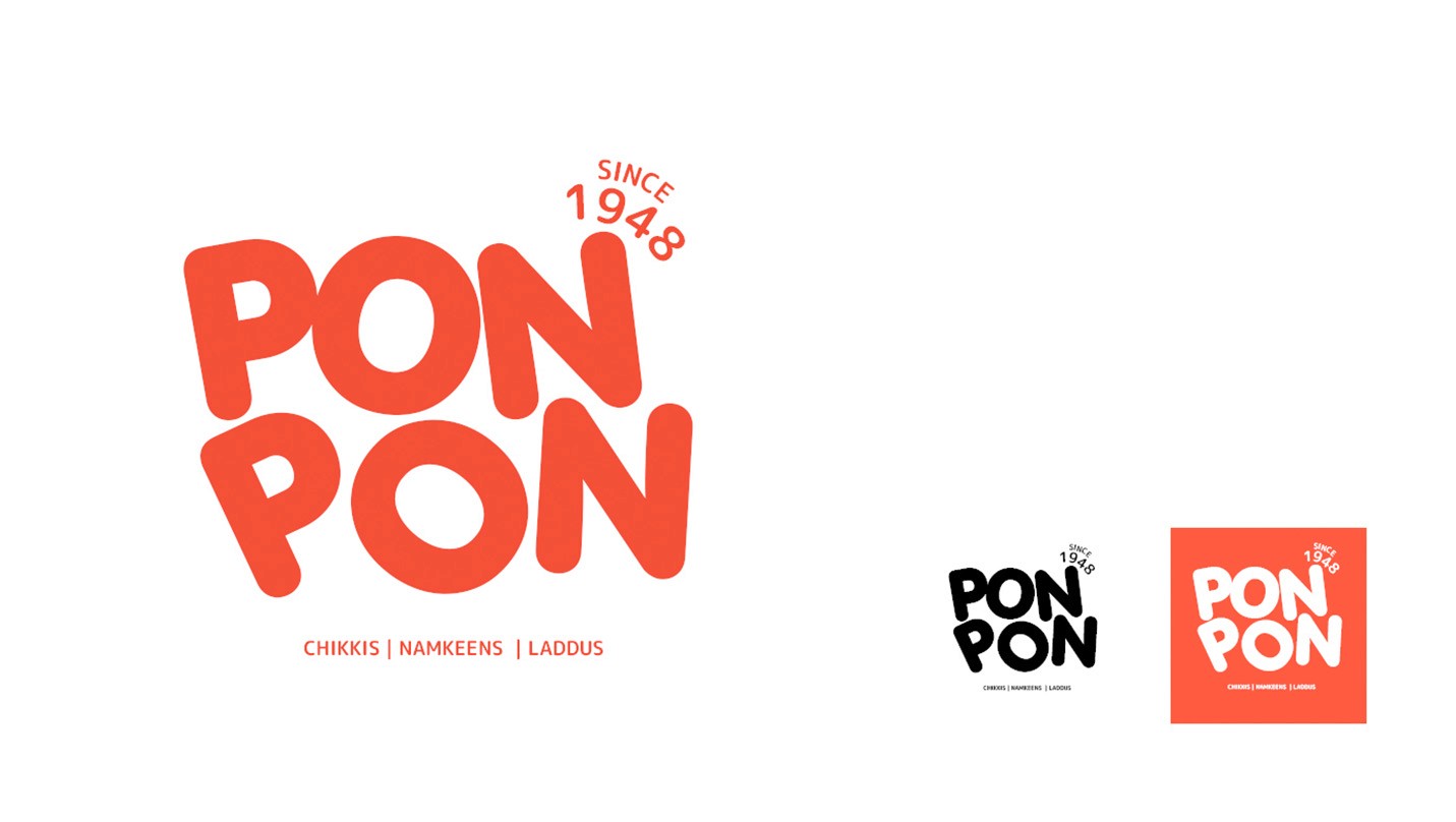
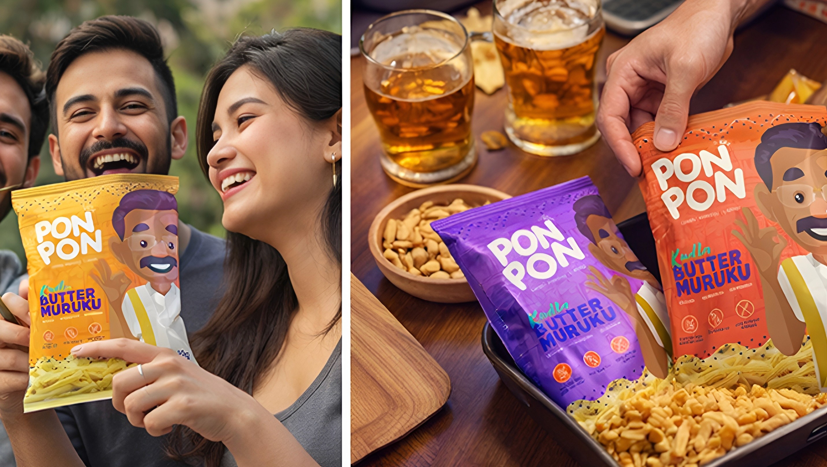
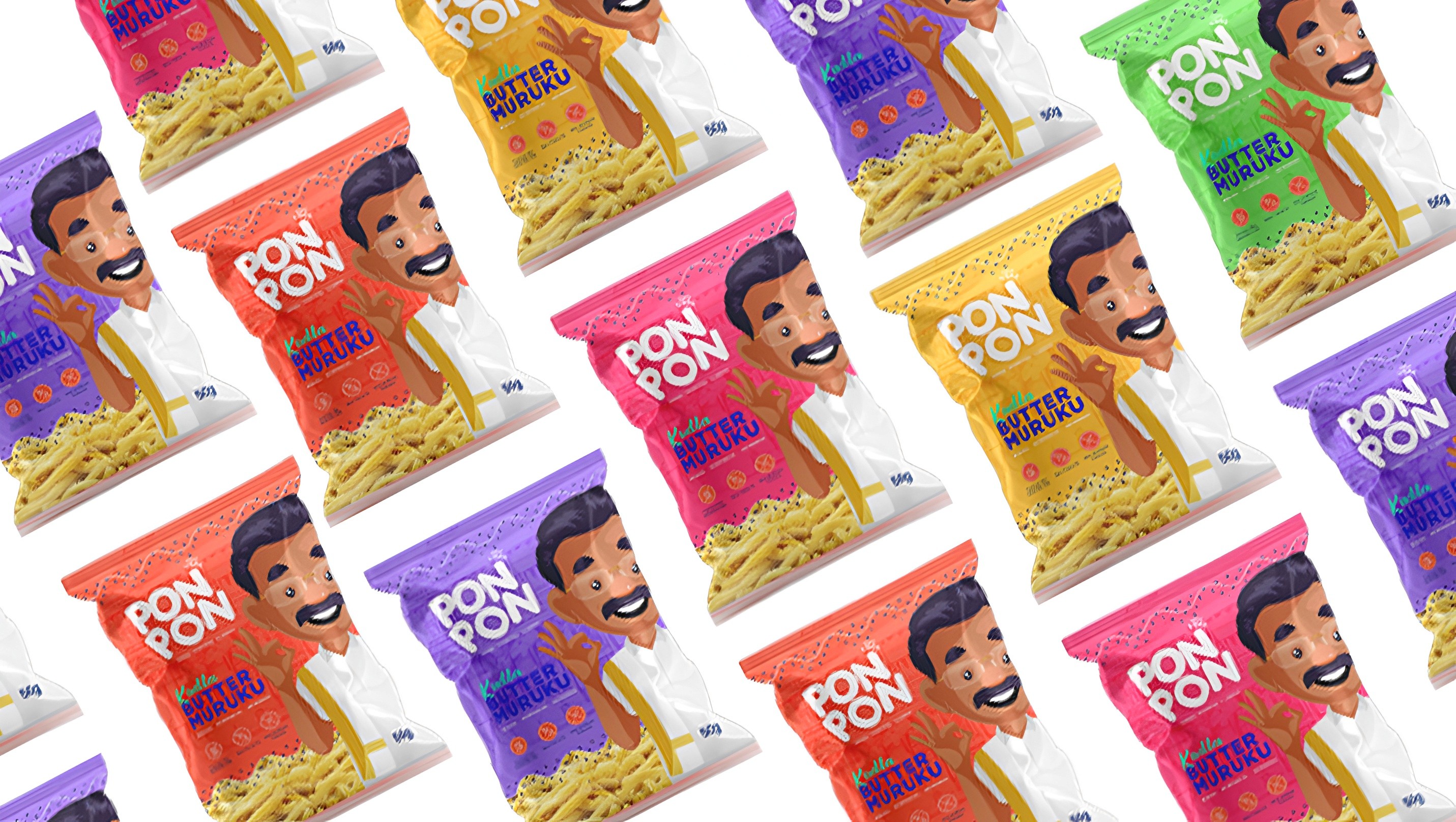
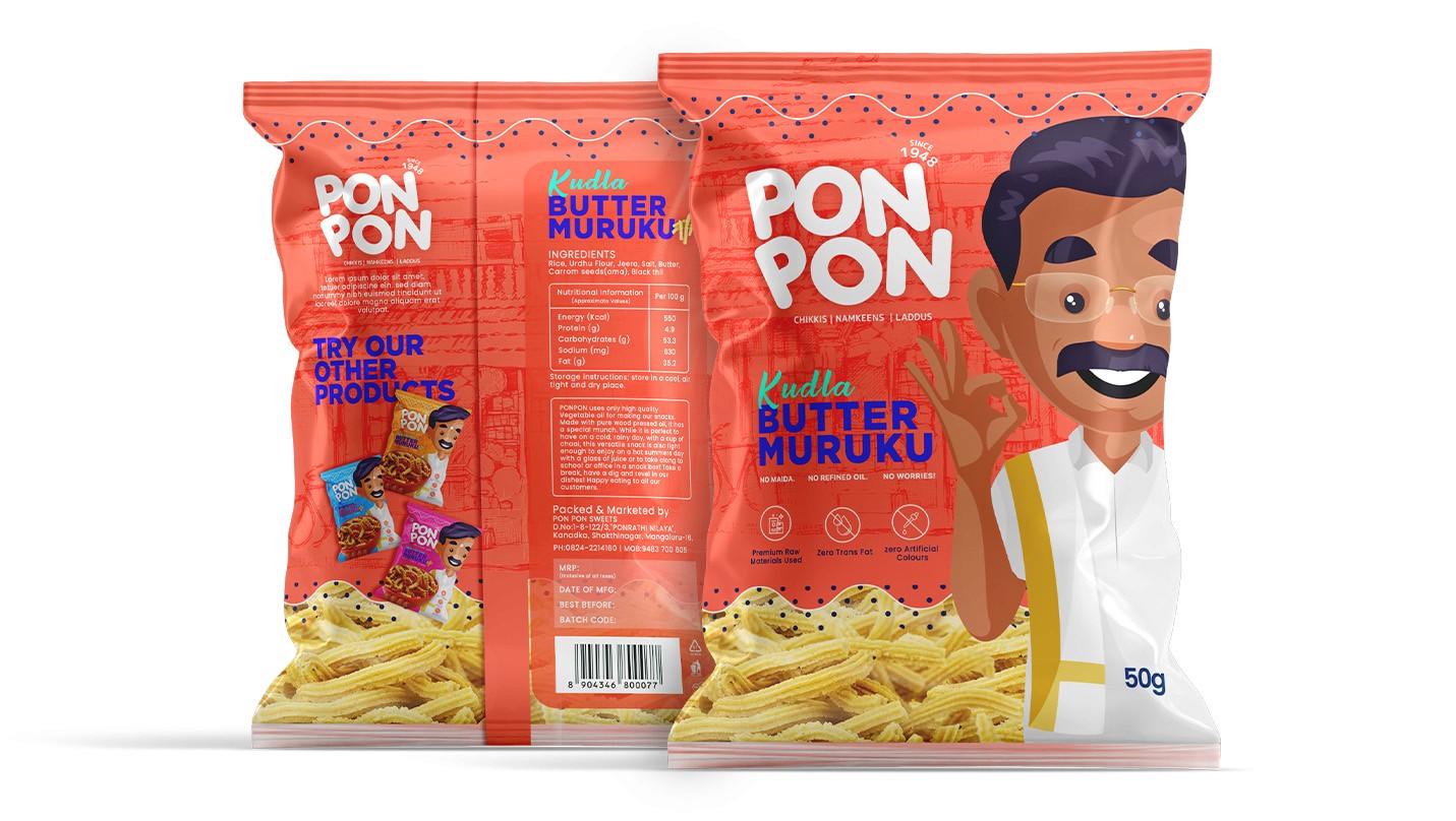
We developed a comprehensive brand strategy focused on visual storytelling and market differentiation, crafting a custom logo system that reflects the warmth, richness, and cultural roots of the brand. By implementing a carefully curated color palette inspired by traditional Indian spices and snack textures, combined with minimalist design principles, we ensured the brand could stand out in crowded retail environments while maintaining consistency across packaging and digital platforms. This strategic approach transformed the brand perception, positioning Pon Pon as a premium and trustworthy Indian snacks brand that balances nostalgia with modern sophistication.

Brand Positioning

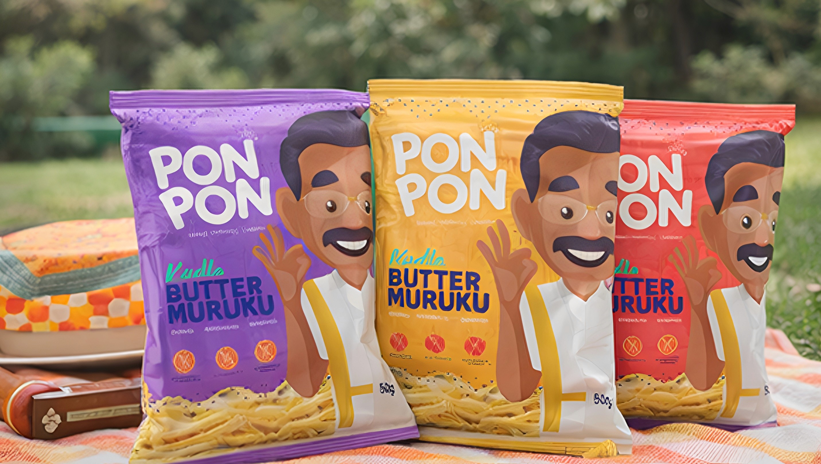
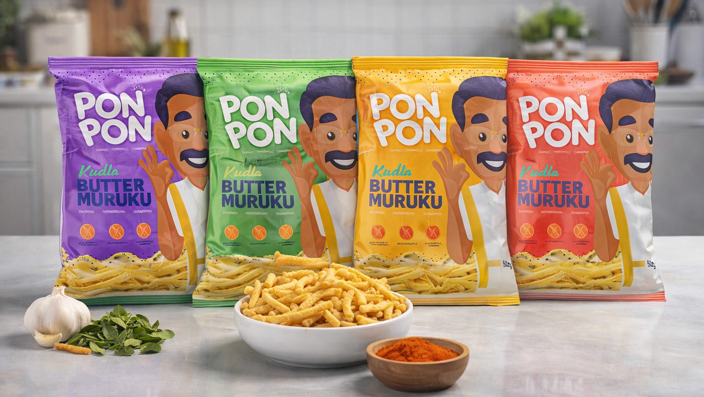
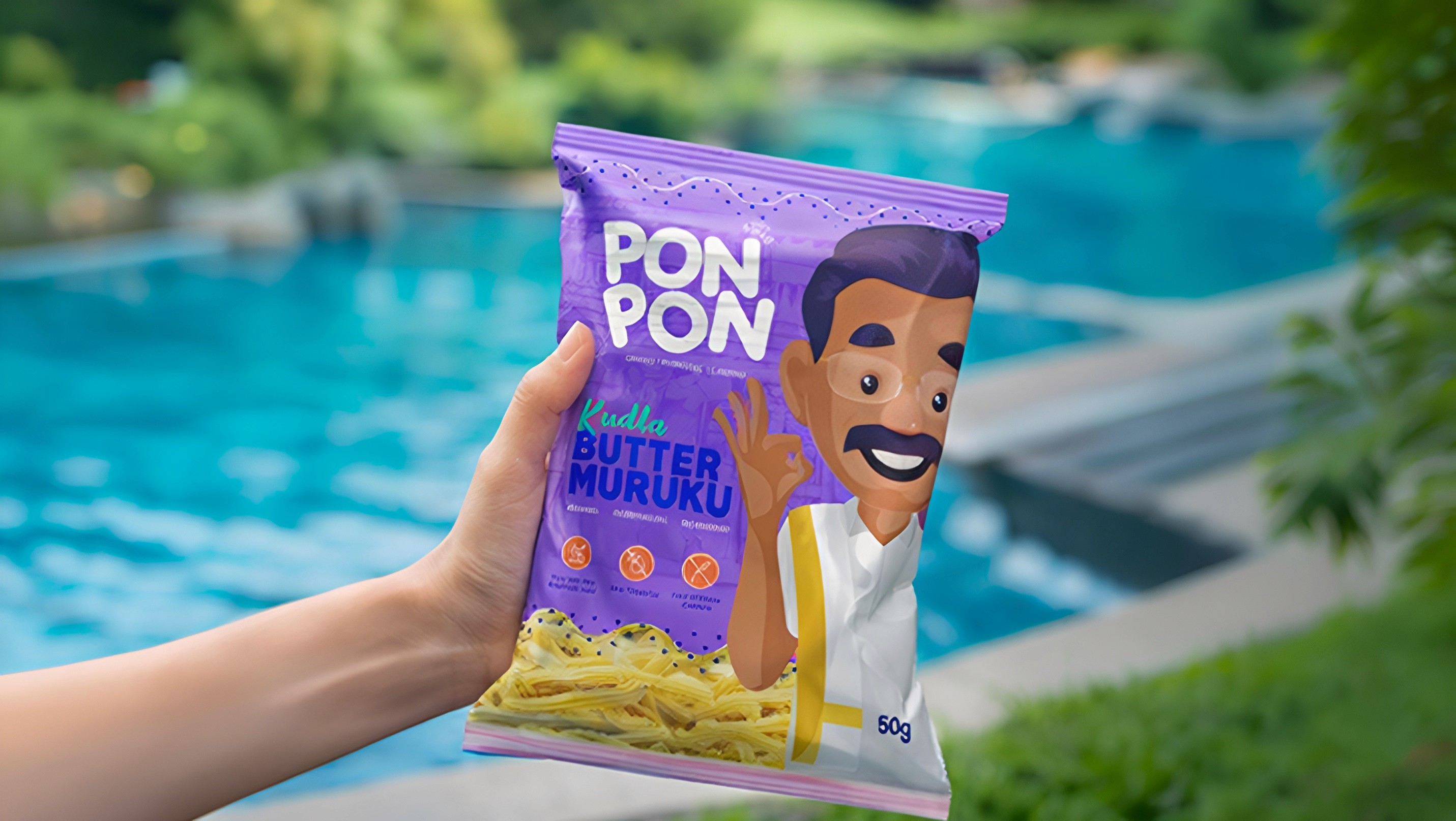
To bring the identity to life, we delivered a complete suite of packaging systems, brand collateral, and digital assets optimized for both retail impact and online visibility. The execution included visually refined packaging layouts, high-quality product presentation, and technical image optimization aligned with modern web standards to enhance digital performance. We also established clear brand guidelines that created consistency across every customer touchpoint, strengthening Pon Pon’s positioning as a modern Indian snack brand rooted in authenticity, quality, and everyday indulgence.